
For this project, we took on the task of redesigning the packaging and identity of the coveted brand Welch’s, known most notably for their jams, jellies, spreads, and so forth. The goal of this project was to simplify and modernize their current packaging styles to make it feel more vibrant, organic, and enticing for the customer, while providing different flavor options that may not be as popular but those that enjoy it will love it immensely.


The target market for this product is ideally young children and parents of those young children, as well as younger adults & college students, it is a sweet spread that is meant to feel like treating yourself, it is a fun snack rooted in a rich, family oriented background. We aimed to build upon this heritage while simultaneously presenting something new for an entirely different generation that is not as hard to get to engage with vibrancy and things that are sweet.

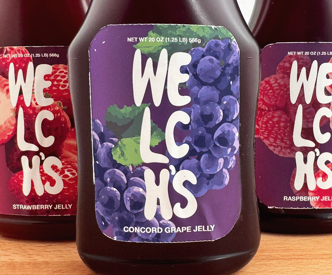
With all of this considered, we aimed to design a new logo and label that felt forward, that drew in any possible consumer with a use of vibrant, crisp imagery as well as minimal yet bold faced text for all other product information in order to be as straightforward as possible; the new logo feels like a perfect reflection of this as well, flowing like liquid, yet solid and grounded within the surrounding elements. The colors are calculated, all residing within a very similar world while being perfectly curated for their selected fruit flavor; a deep red for strawberry, a fuschia tinted maroon for raspberry, and a warm electric purple for the signature concord grape.


